Fidelity Student Debt
44 million Americans have student debt. Student Debt Direct is a workplace benefit that employers can offer to their employees through Fidelity. It is primarily a retention and hiring incentive where the employer agrees to pay some amount of their employee's student debt every month.
The product requires complicated loan verification and management with cumbersome loan service provider systems. Any hope of automating the verification process has been squashed under the current presidential administration.
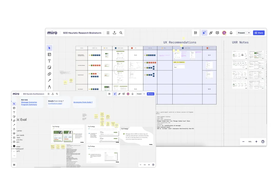
One of the first things I did after being brought onto this project was to learn the existing product front-to-back. I worked with the systems analyst to create a miro that maps the entire lifecycle of the product.
UX lifecycles miro board
Next, I partnered with our user experience researcher to run a heuristic study. I even coded the frontend for a reference user interface we would use in this study.
We hosted two two-hour meetings where we took turns interacting with the reference user interface while going through specific scenarios a user would go through in the lifecycle. Then we wrote sticky notes on Miro, talking about things we liked and didn't like, things that seemed to give us problems. We also spoke to a few users from within Fidelity who use this product, asking questions and gaining insights from them.
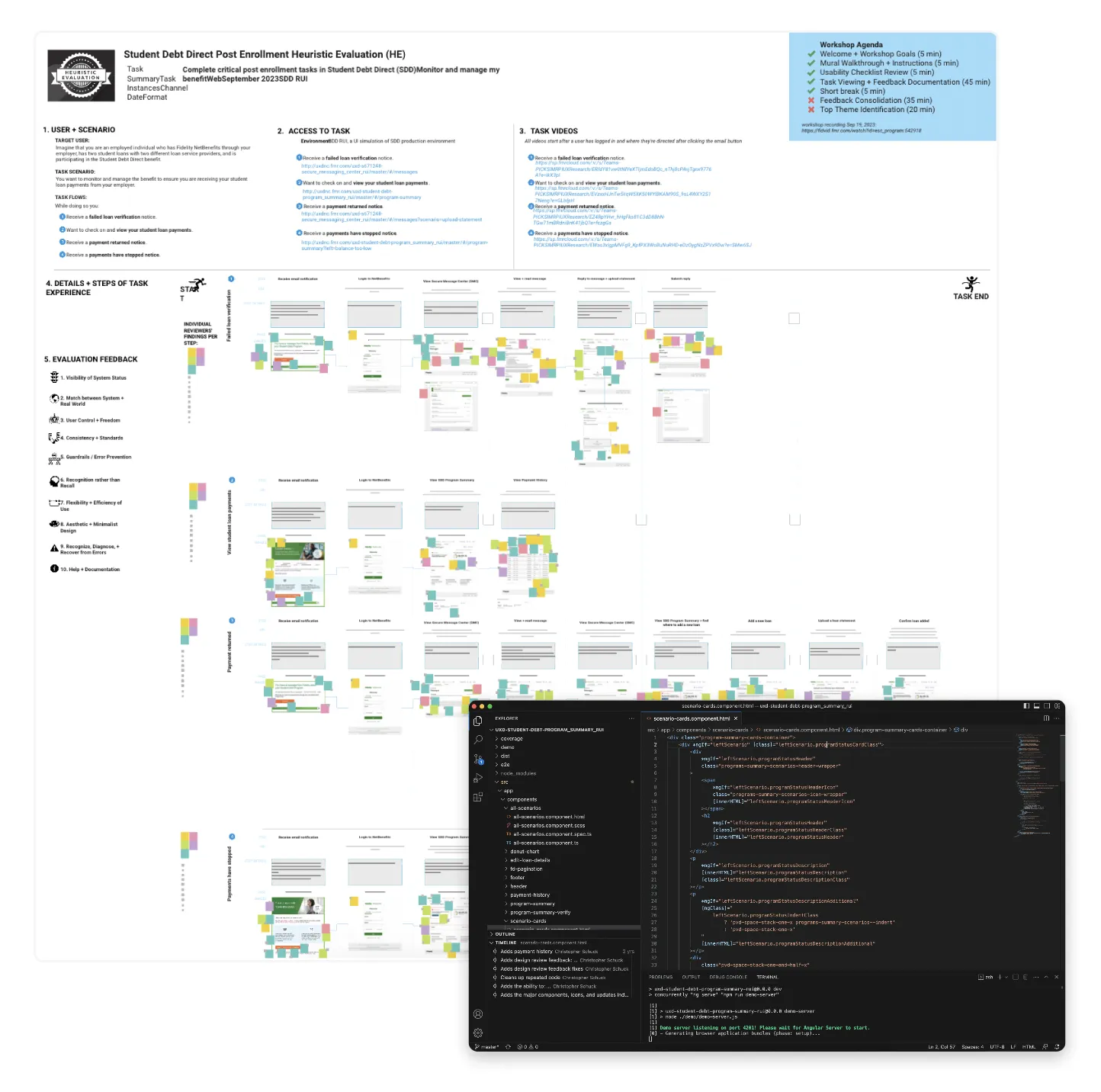
Miro board and screenshot from Visual Studio Code
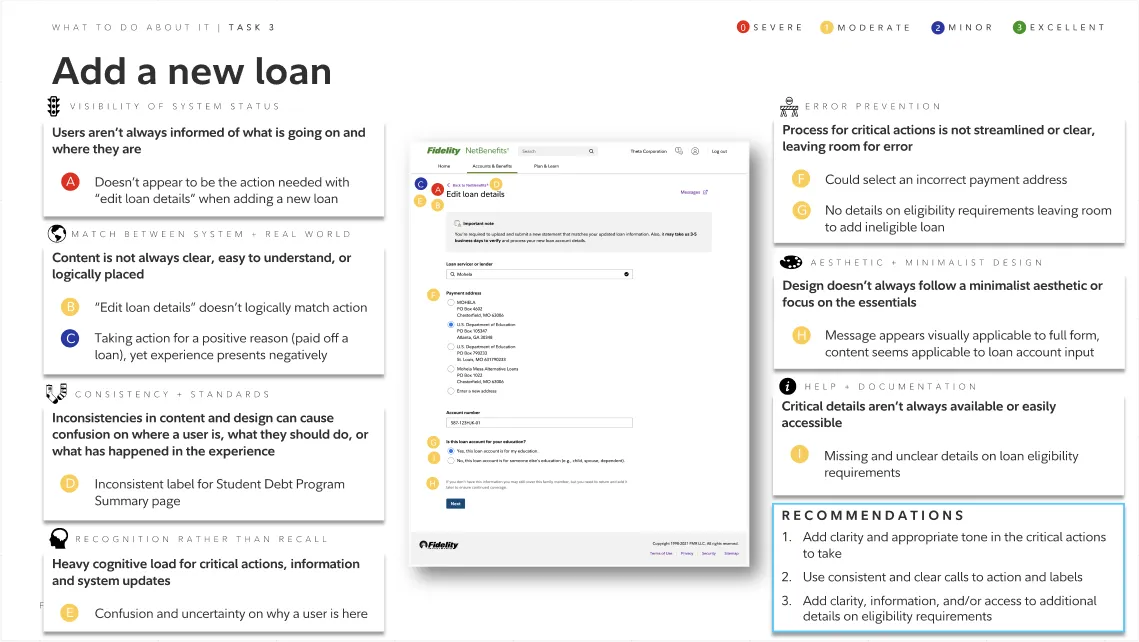
Users aren't clear on loan management
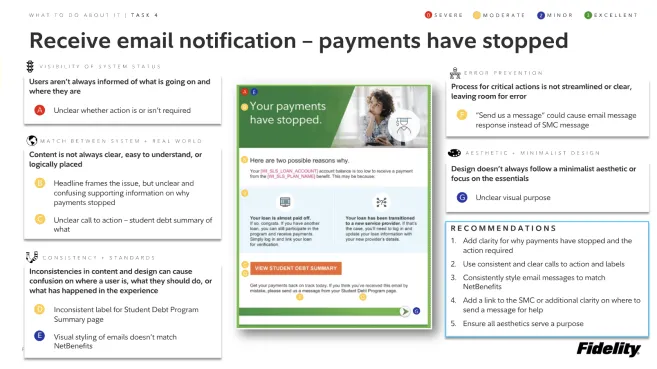
Communications are problematic
Through our research sessions, we identified key friction points in the user experience that were causing confusion and frustration for employees trying to manage their student debt benefits.
After identifying pain points, I continued discussing with product owners, analysts, developers, and more. Maintaining formal meetings twice a week, I facilitated discussions meant to excavate ideas from all stakeholders involved in this project. By showing off problems with the current product and showing very rough, low-fidelity designs for ideas, everyone involved was able to have a sense of ownership and come forward with ideas.
Discussions on Zoom, using Miro to collaborate on ideas
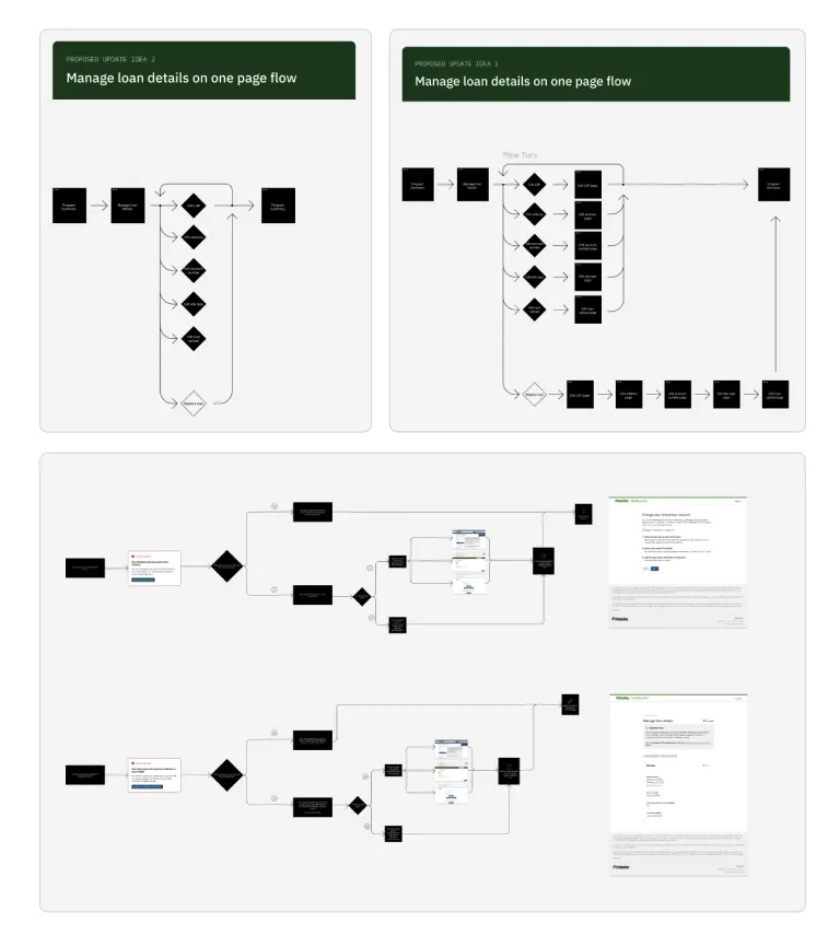
Sketching, primarily with flow diagrams
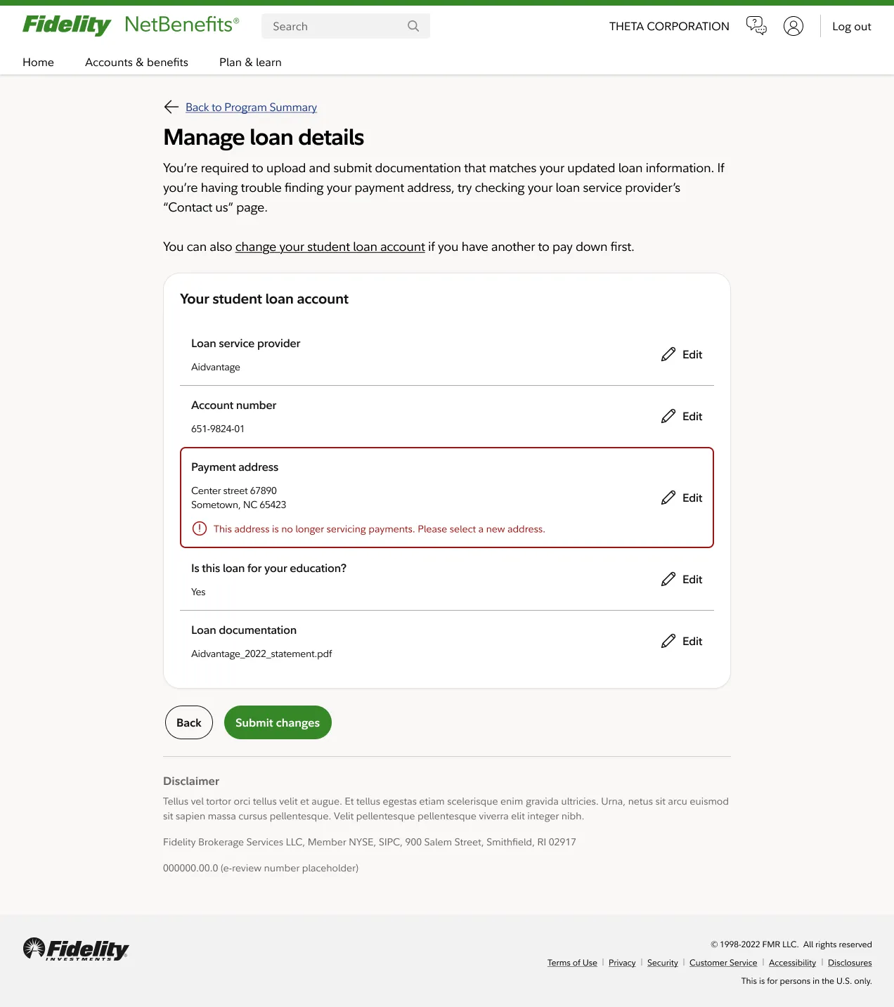
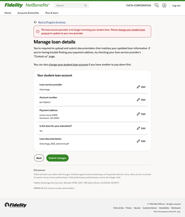
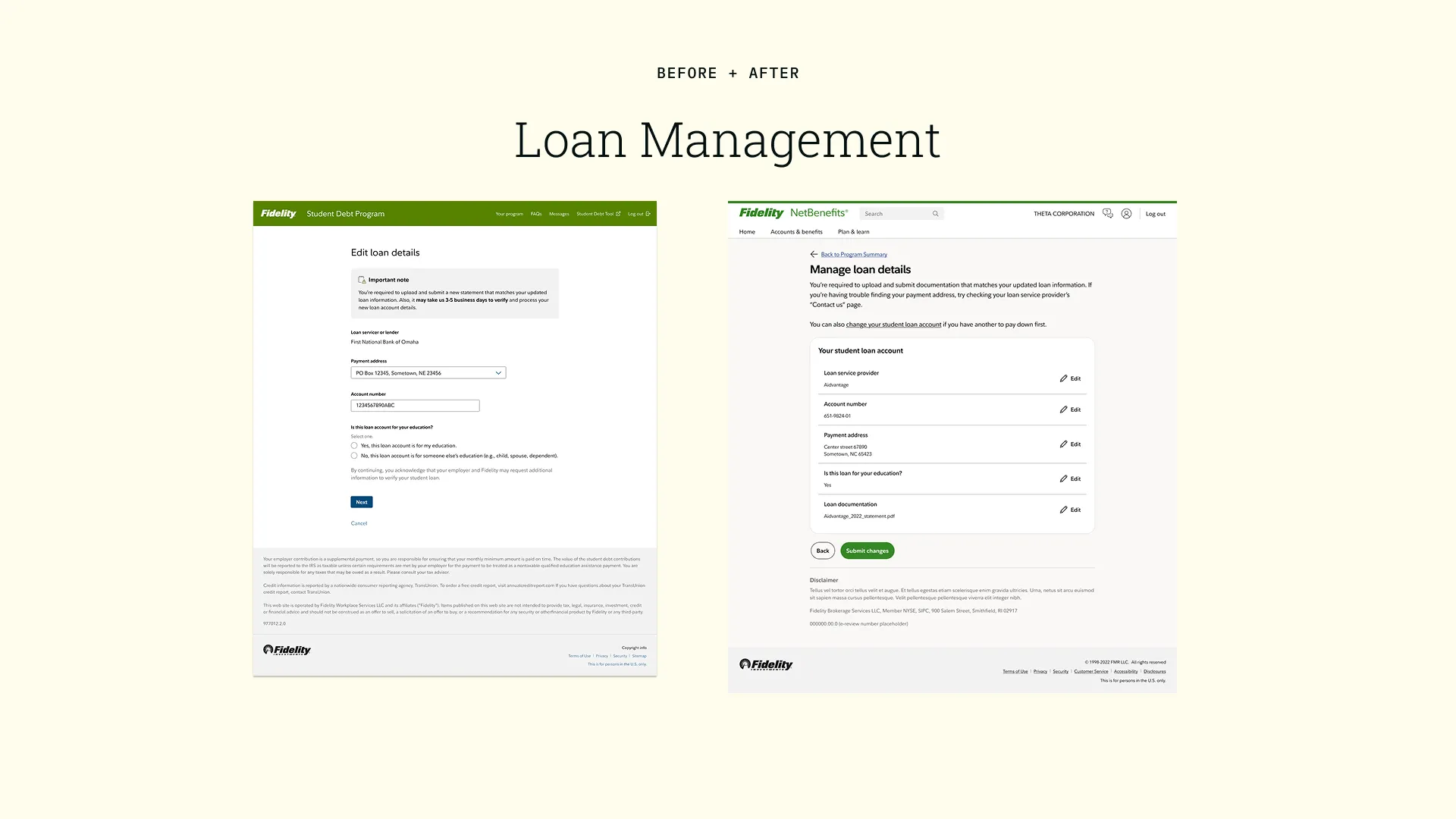
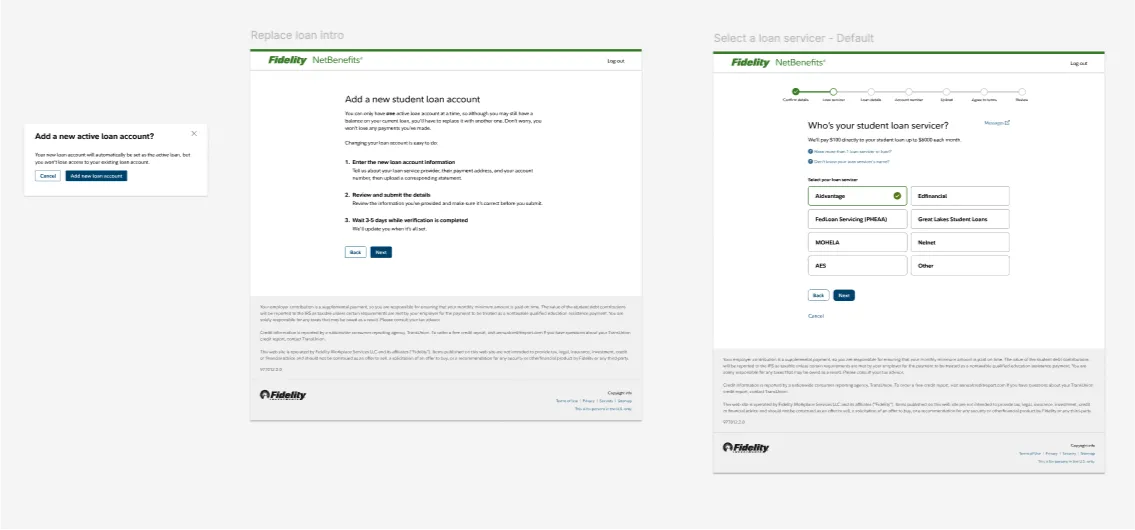
One of the most significant solutions we encountered and built was to separate the complicated loan management procedure into two separate flows. We can determine if the user needs to edit a loan and give them one experience. If the problem is more complicated and they need to add a new loan, we can give them a different experience. Additionally, allowing users to add additional loans and see a historical record of their accounts develops trust and ease of swapping in the loan they most want to be paid off first.
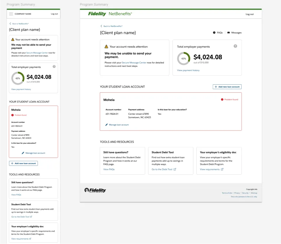
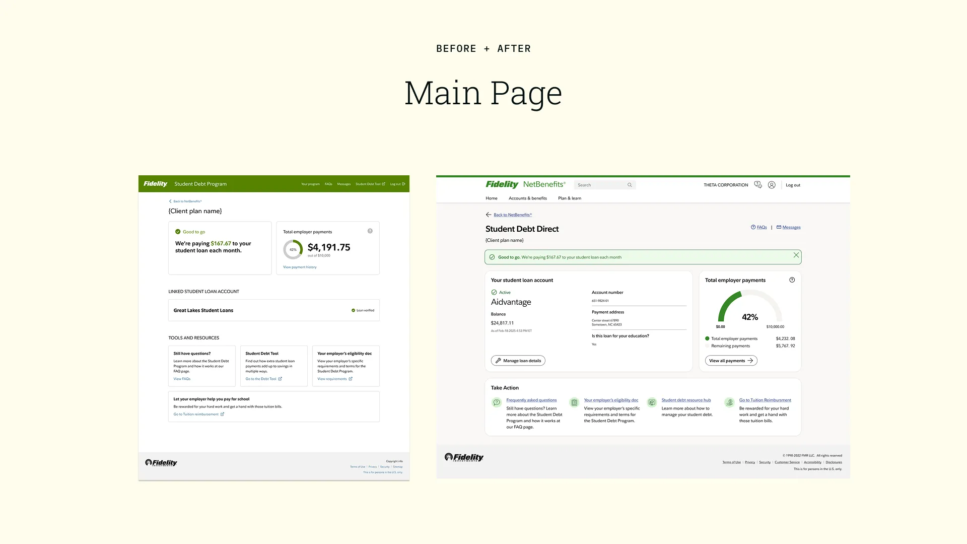
New additions to the dashboard include separate actions for editing and adding loans
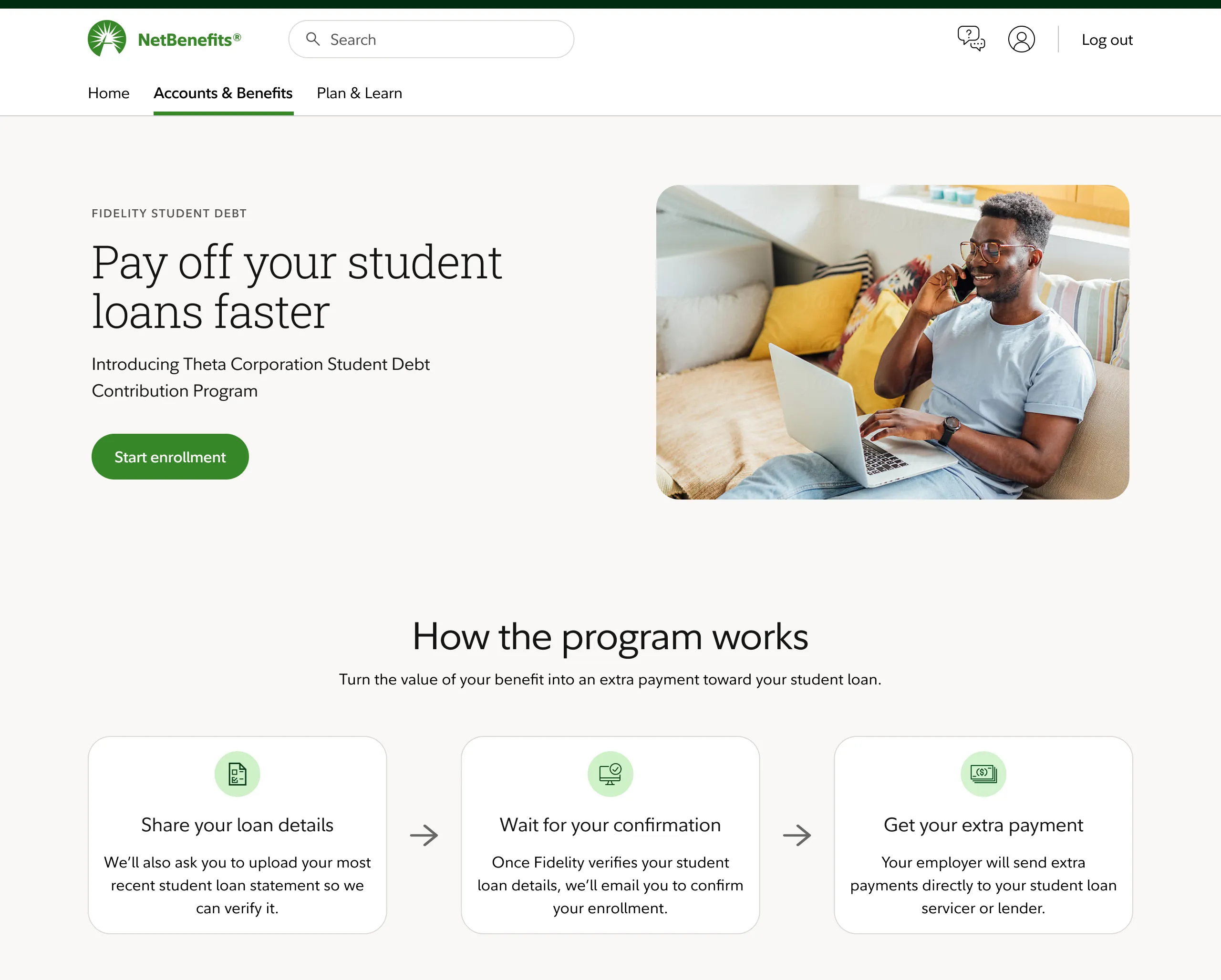
Fidelity is currently overhauling their design system and working to unify all their products. Component reuse and accessibility are priorities for the business. I am helping to establish consistent patterns, like the way you edit an account, throughout the enterprise experience.
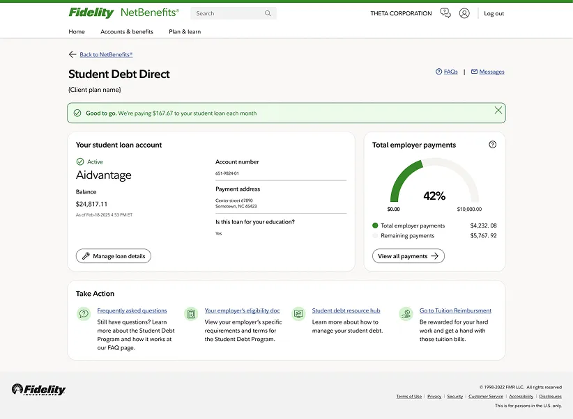
Updated look for the post-enrollment dashboard
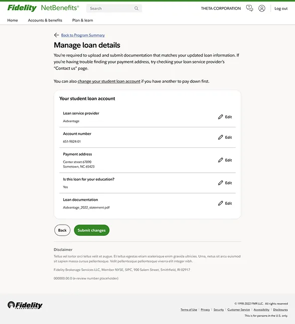
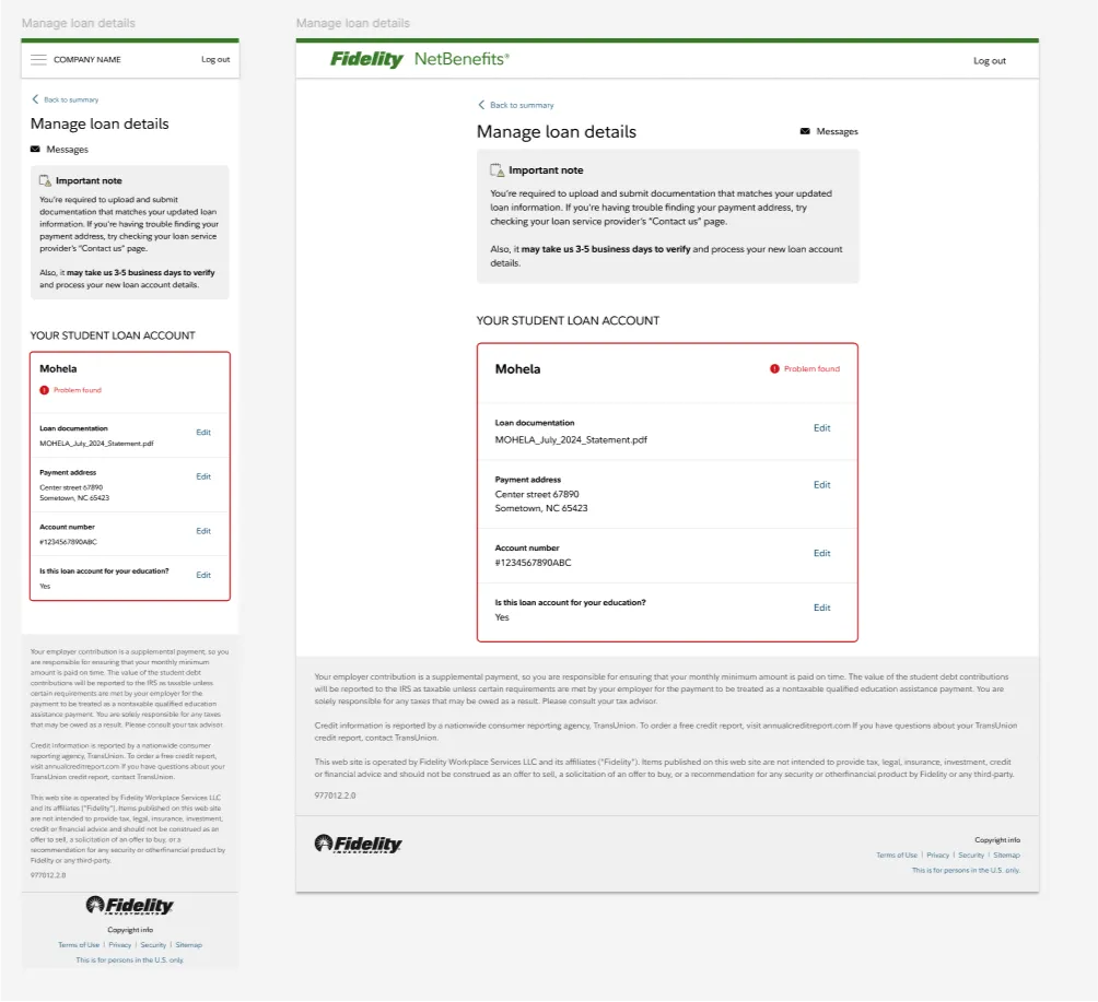
Updated look and pattern for loan management
In the final iterations of the design, we have introduced inline alerts that tell the user when there are problems with their loan. The alerts help users understand what about their current loan is problematic and how they can go about fixing their issue and getting back to receiving payments.