Greenways.com
We started with a content audit. I led the information architecture and WordPress development, and we worked in sprints, sharing prototypes with Chuck before moving forward.
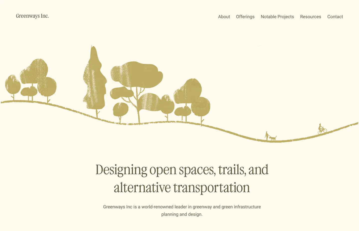
Homepage built on top of WordPress
The old structure was deep and confusing. We flattened it around Chuck's core services, so visitors find what they need in one click.
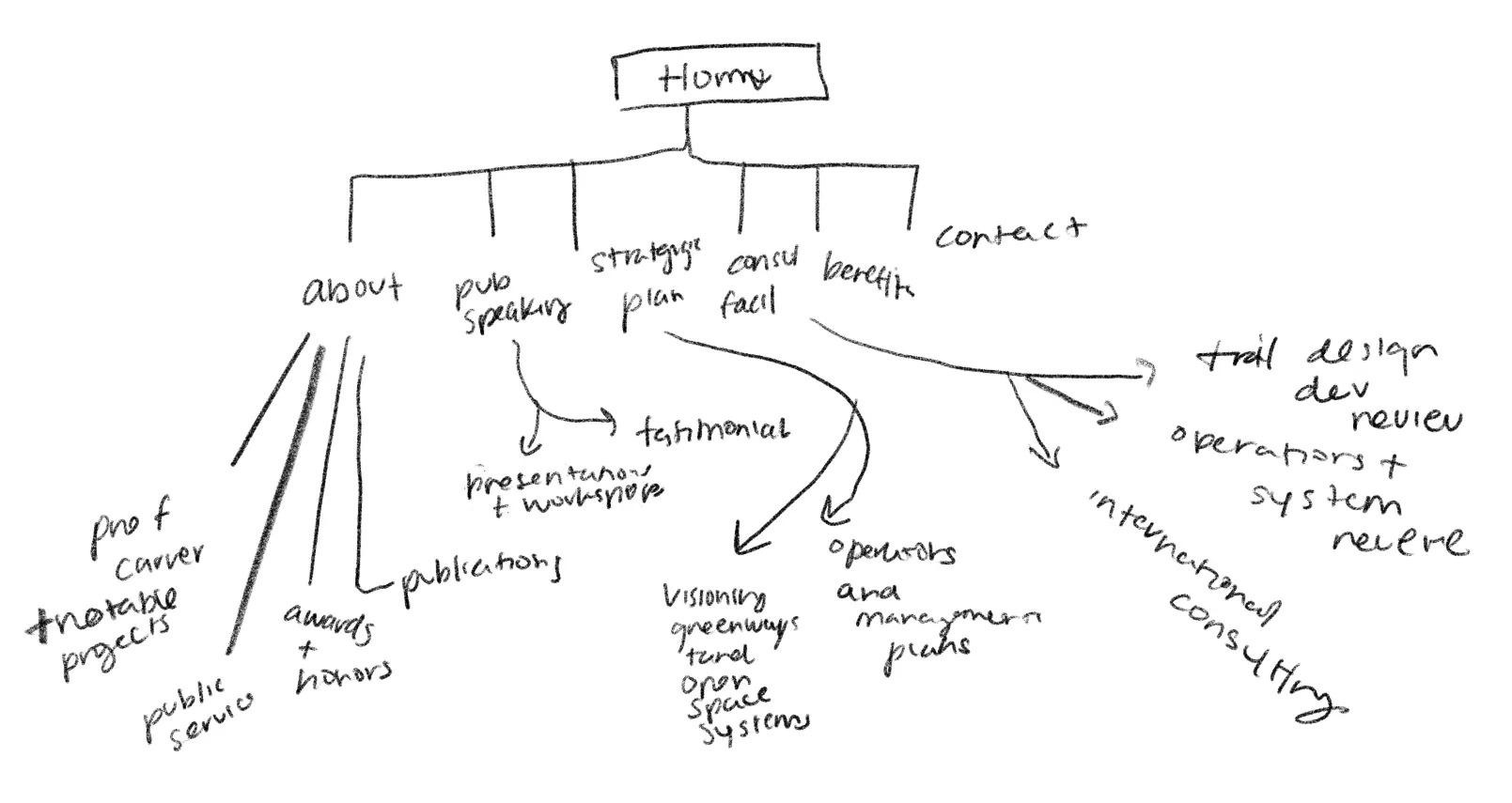
Original sitemap
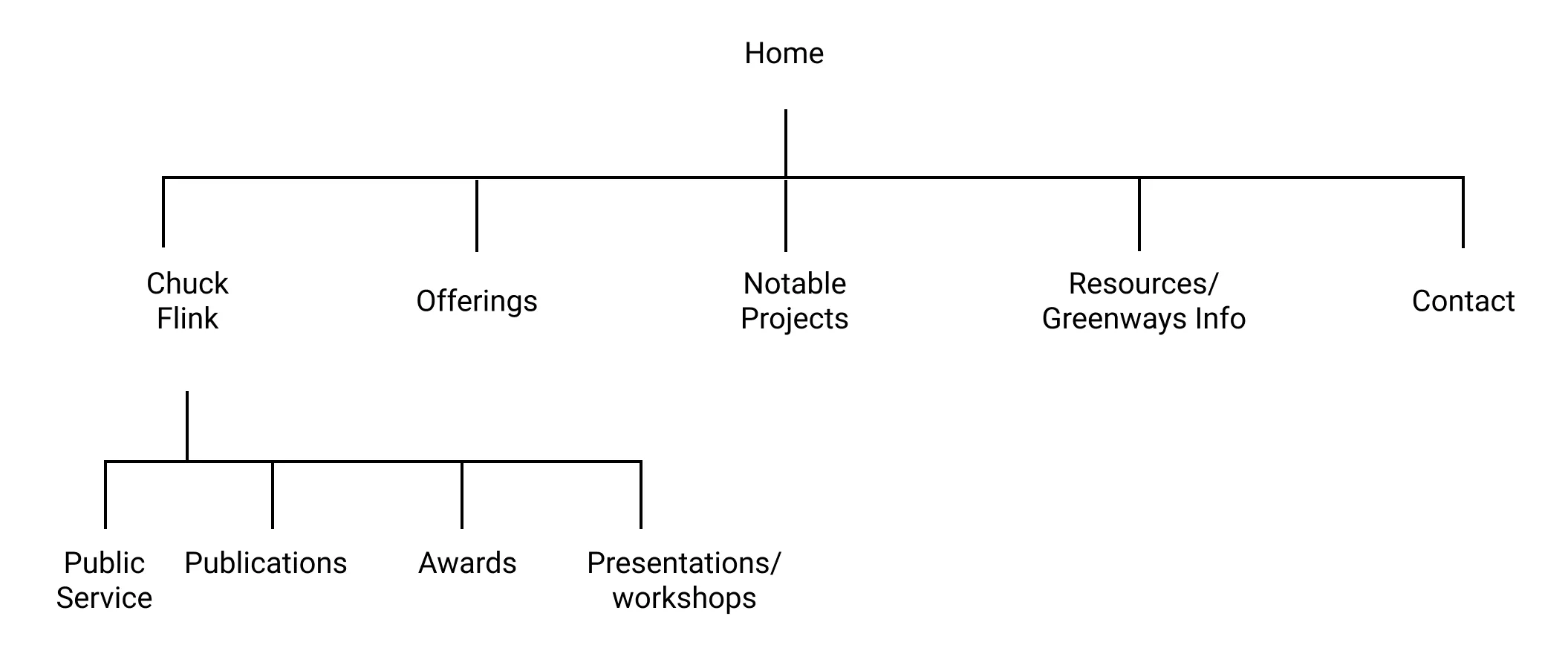
Revised sitemap
Chuck's brand needed to feel clean but still rooted in nature. A light palette, clear typography, and generous white space put his portfolio up front.
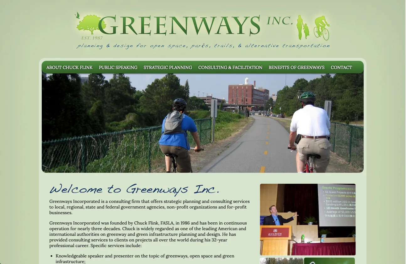
Before
After
Elizabeth drew a botanical illustration for each of Chuck's five highlighted projects, using a plant native to that project's region.
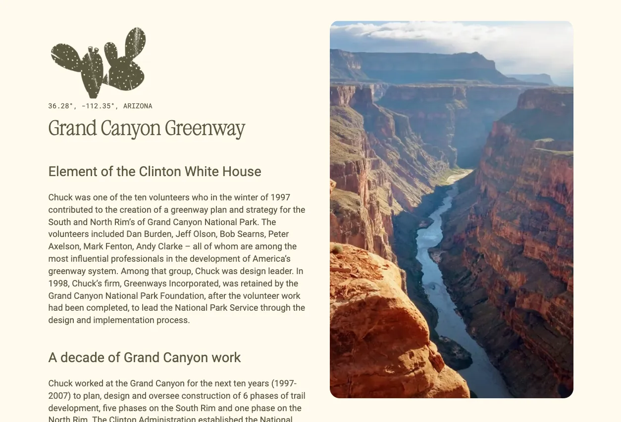
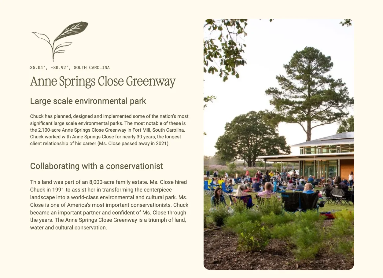
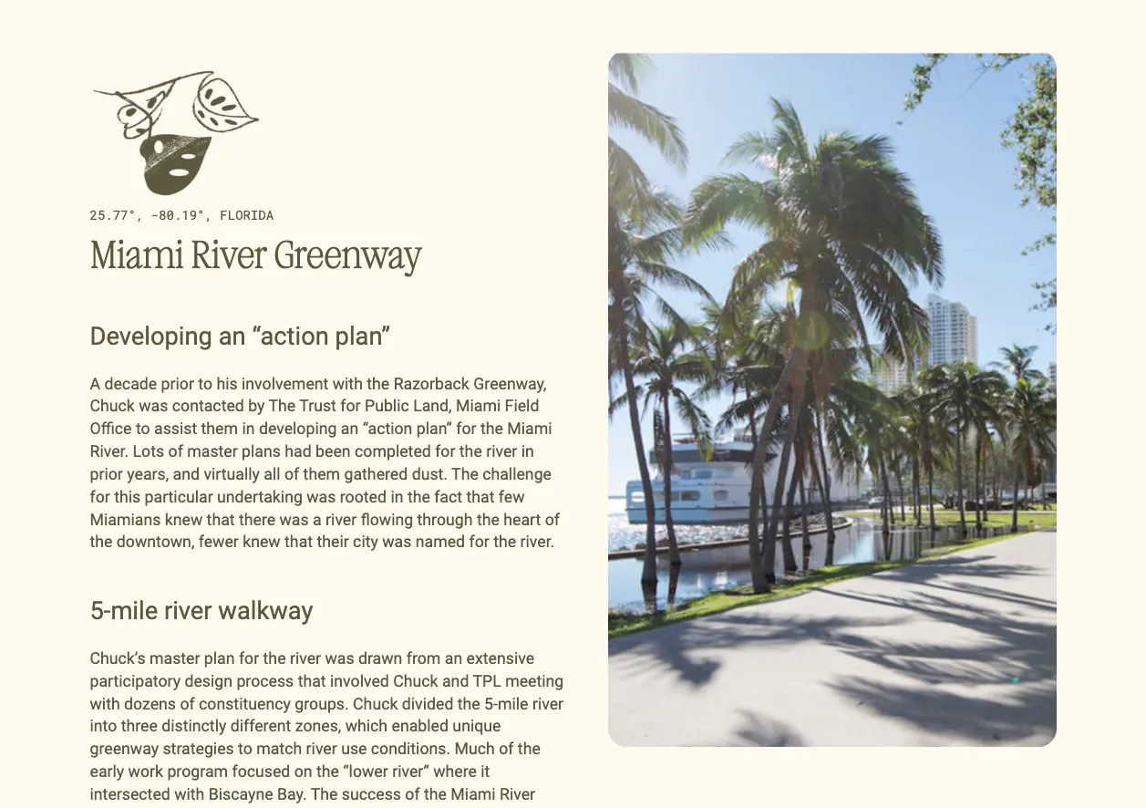
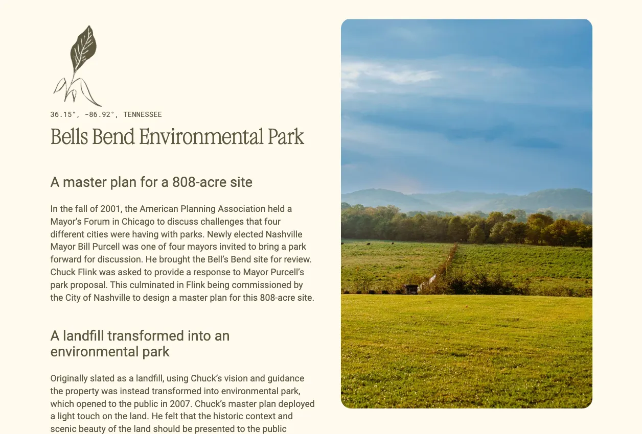
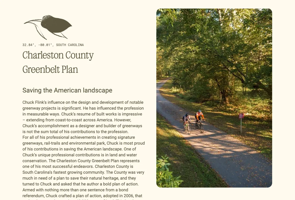
A dedicated intro section on the homepage for Chuck's credentials and past projects.
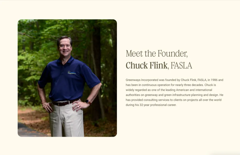
Feature: Expert profile
A scannable grid that breaks each service into plain-language headings and short descriptions.
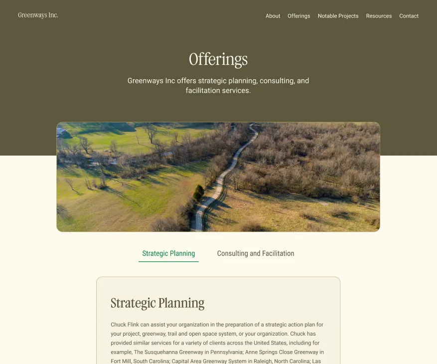
Interactive service breakdown
The old site was desktop-only. We rebuilt every component so touch targets, layout, and typography adapt from desktop down to phone.
Mobile view
Chuck has a site that matches the quality of his work, and he can add new projects as they wrap without waiting on a developer.
Live site