Laboratory for Analytic Sciences
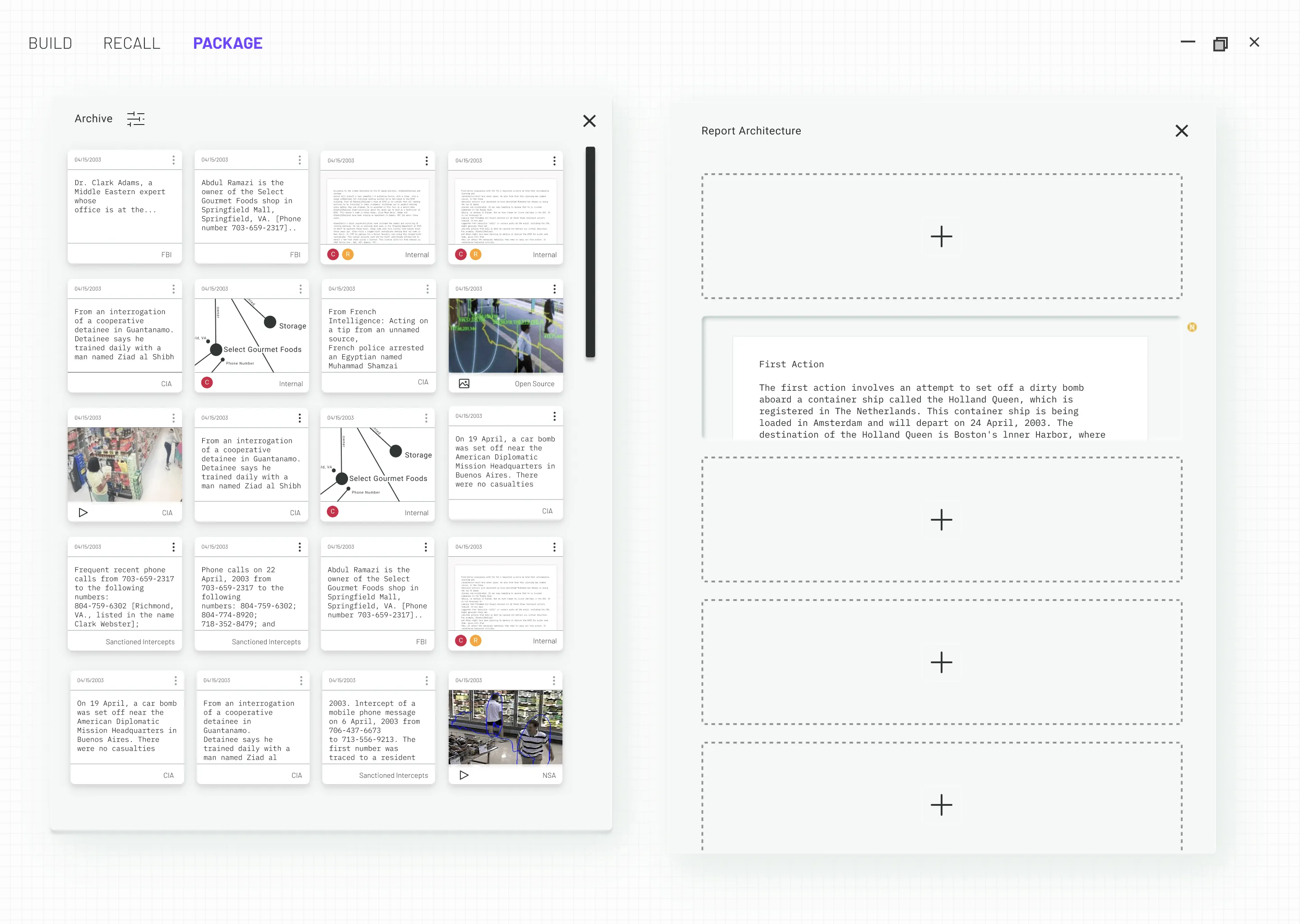
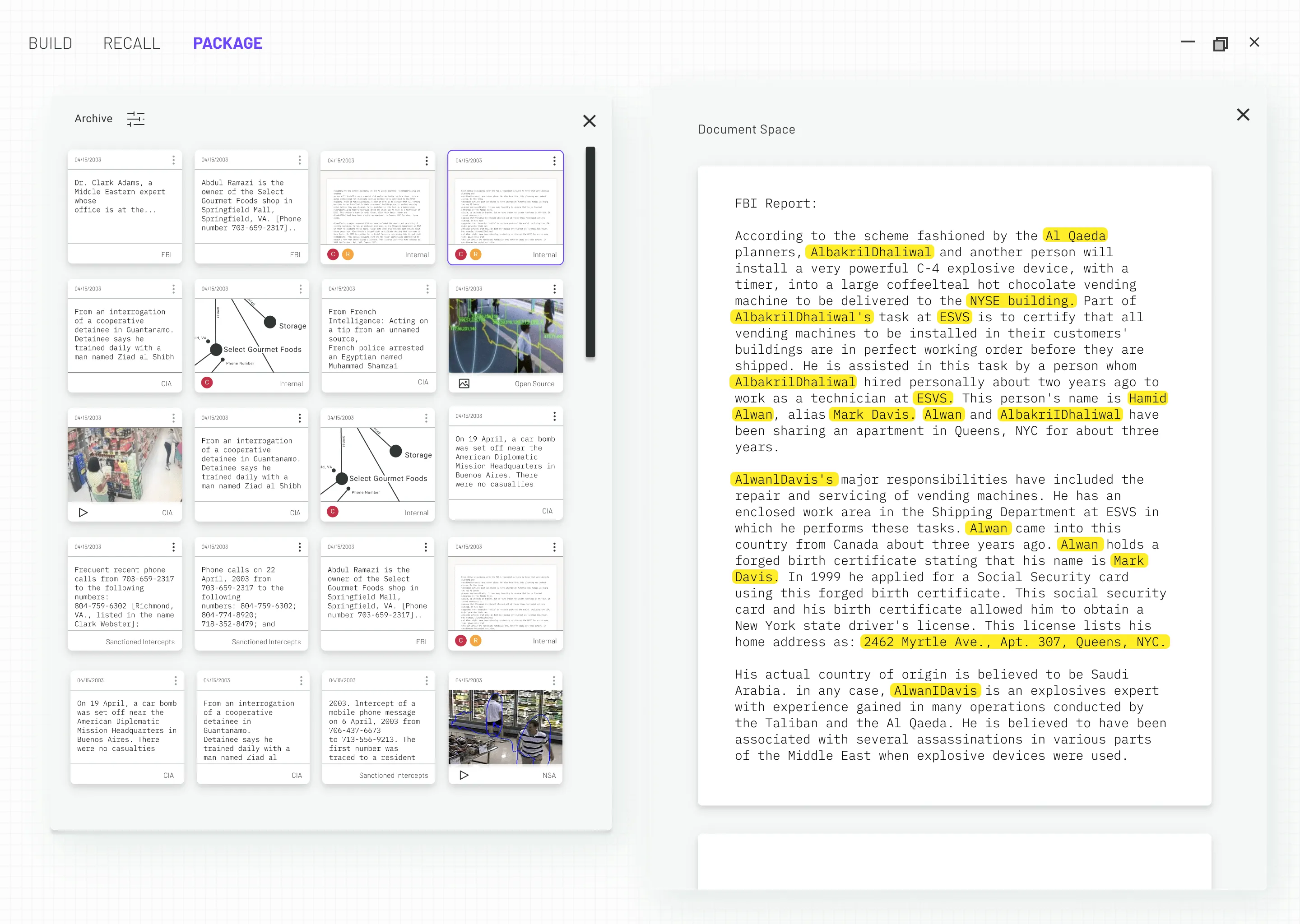
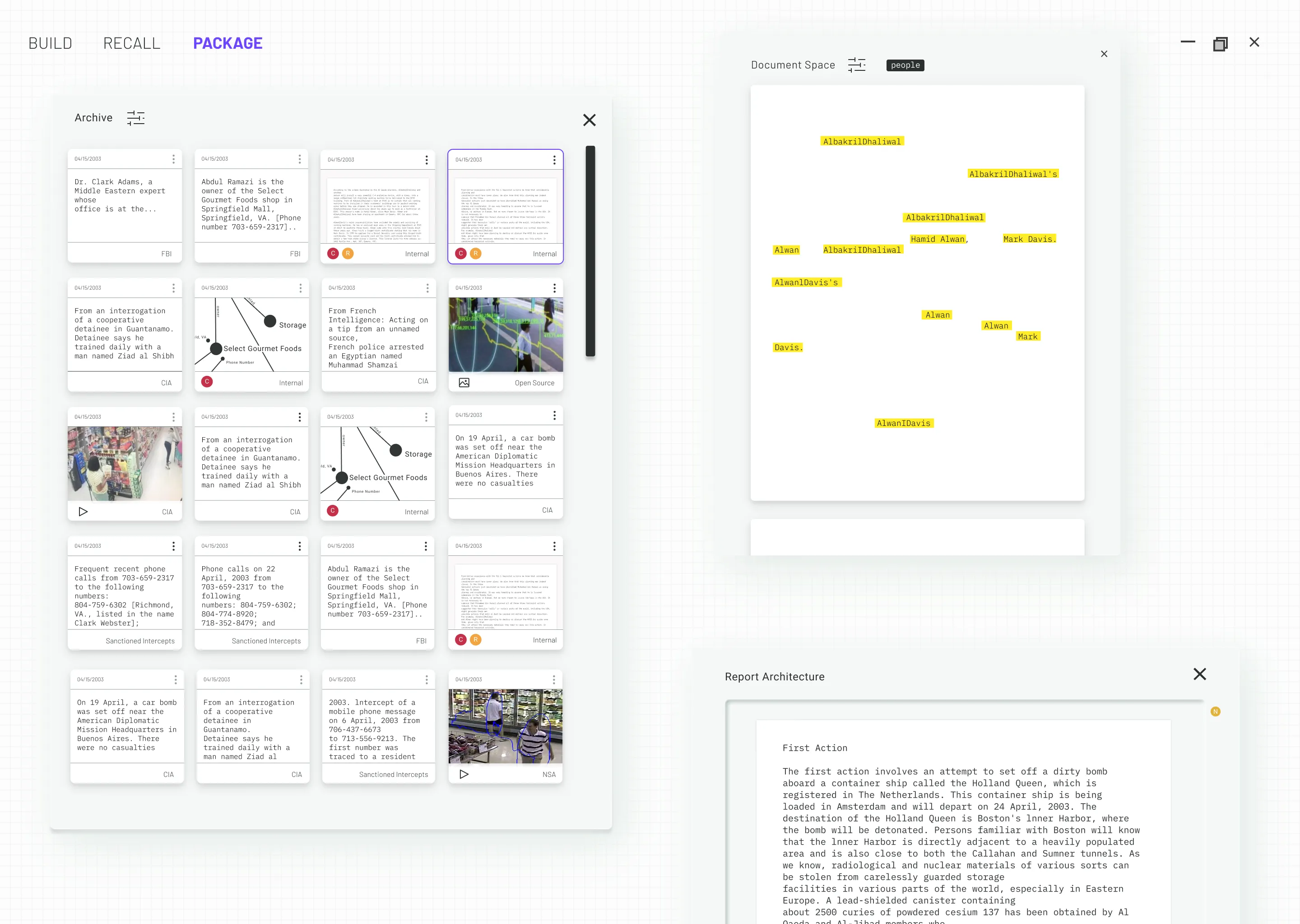
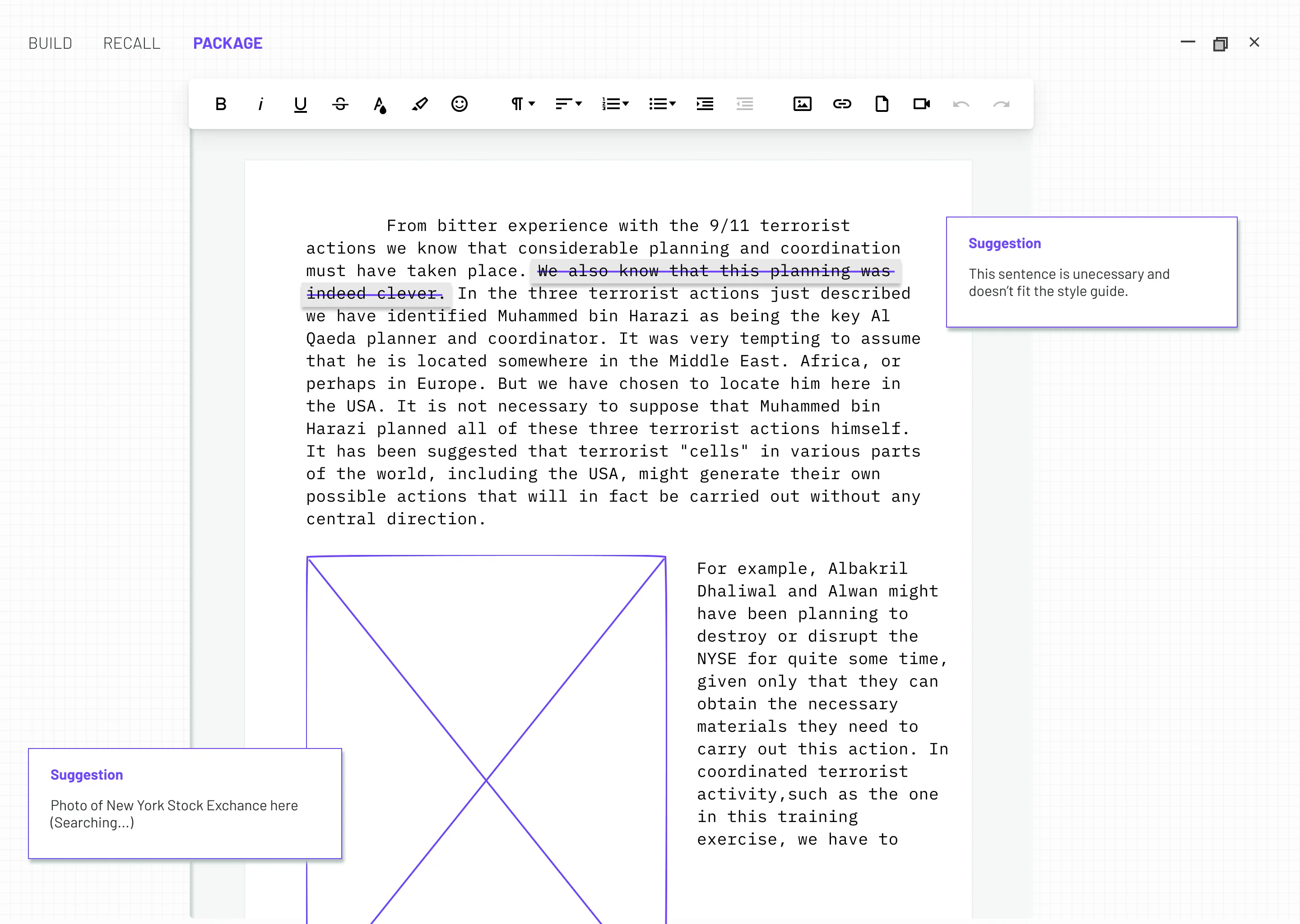
When intelligence analysts get to work in the morning and open up their Atlas software, they see a summary of their day's work. All new reports are summarized by AI in a running text on the left side of the screen. Pre-highlighted words are paired with images and external documents arranged on the right. Emails, customer interests and tag filters are arranged at the bottom of the screen.
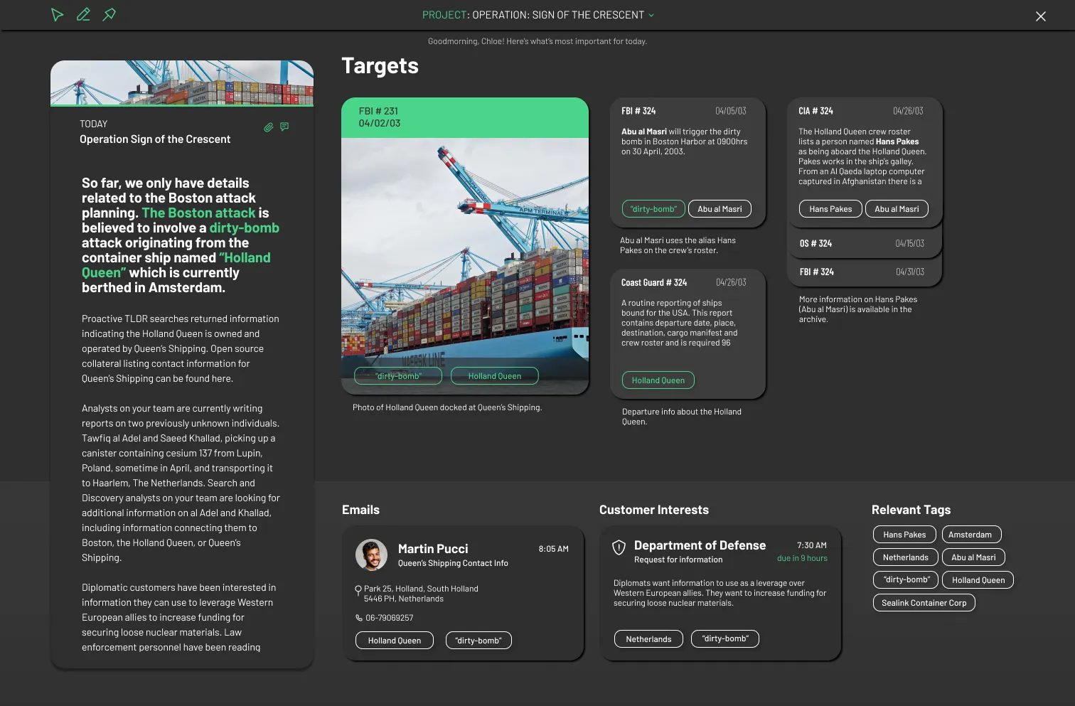
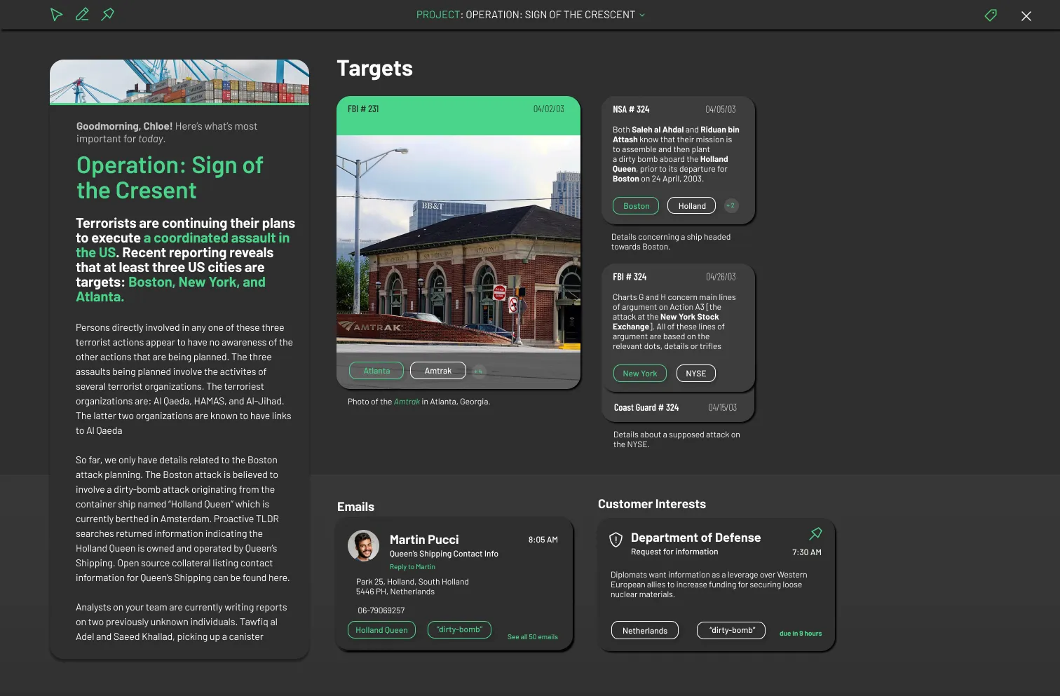
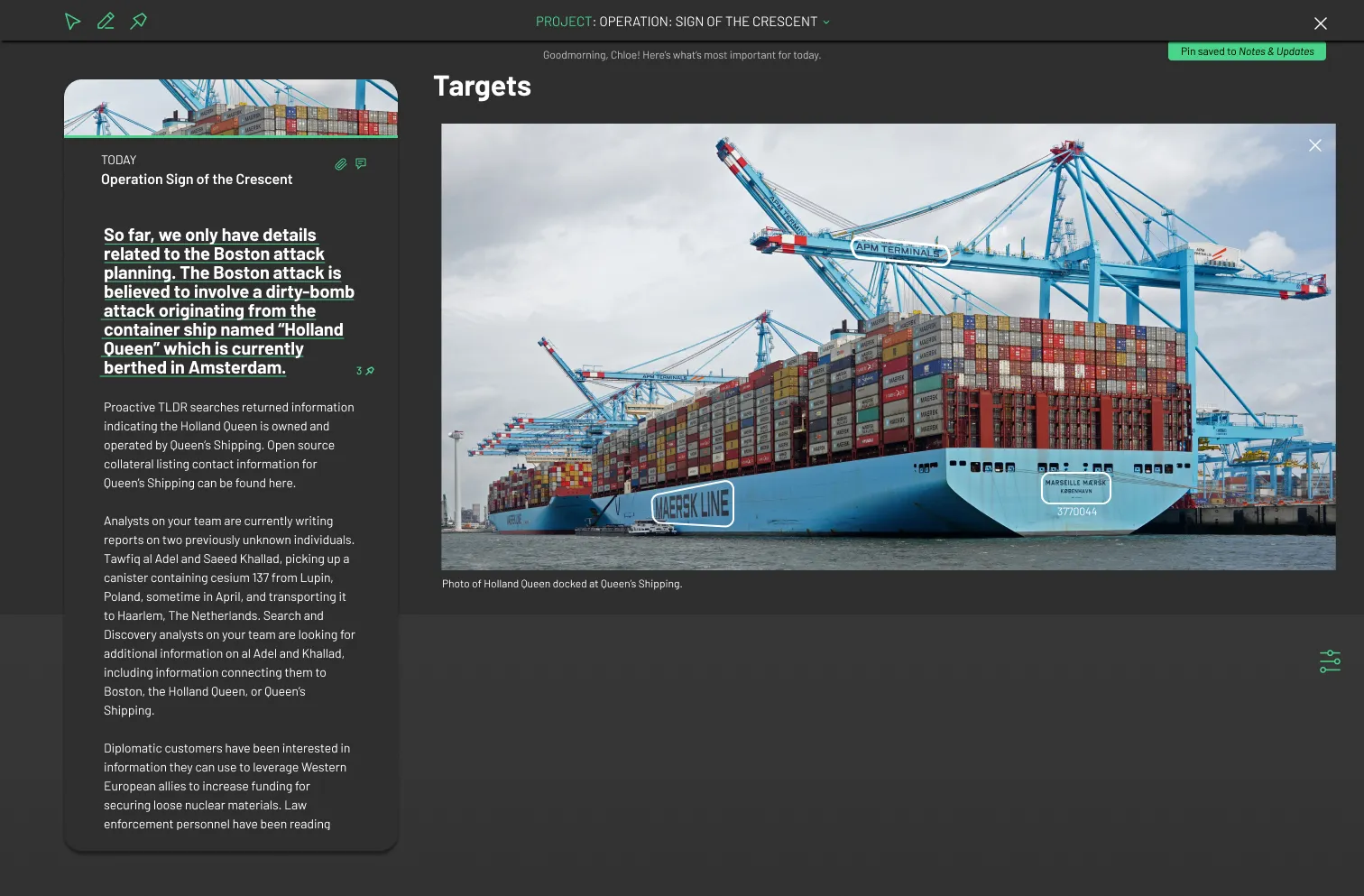
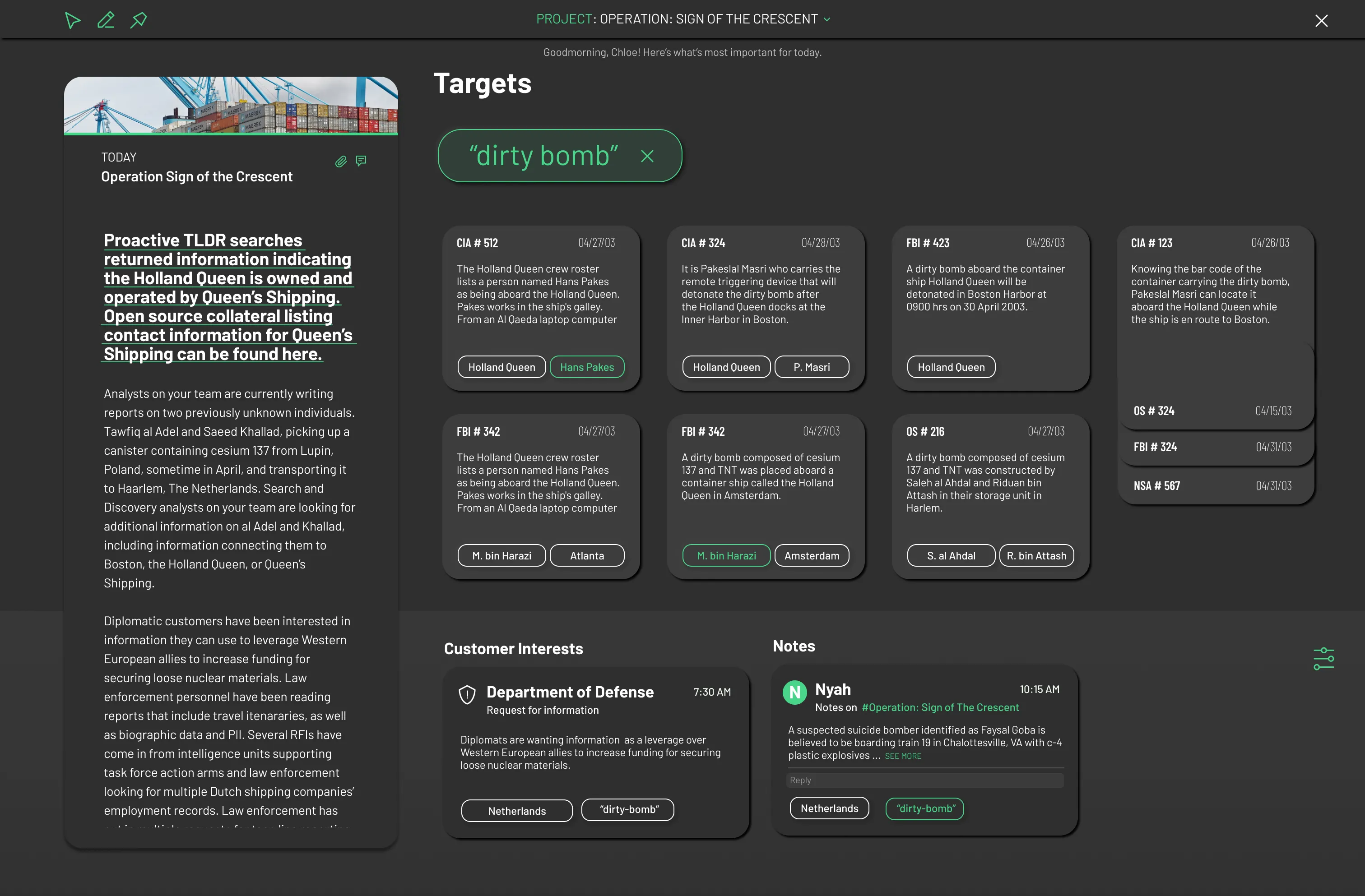
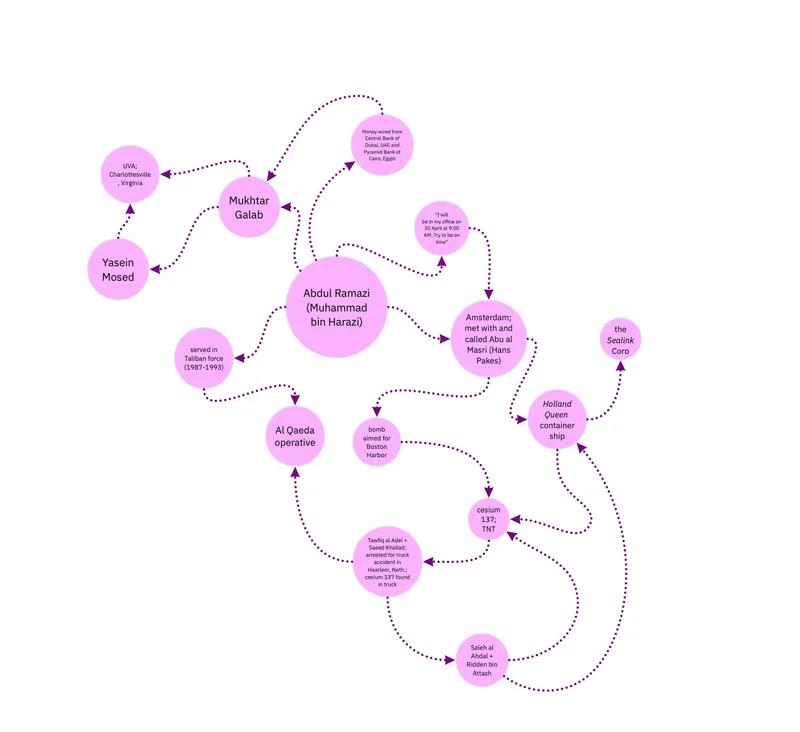
Intelligence analysts have been tasked to provide indications and warnings of potential terrorist actions against US interests. Many of the terrorists have never been identified, and are scattered all around the globe. They are members of different but often linked organizations and can be called upon at any time to unleash acts of terrorism of many different sorts. Chloe is faced with lots of "dots" in the form of intelligence data that come from many different sources. Her first task is to decide which dots she should be trying to connect and then to make inferences about what these connections may mean. This is the basic step in generating hypotheses about what these connected "dots'' might mean.
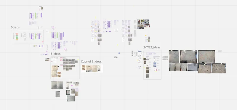
Before heading into Figma, Miro was our home for collaborating on notes and research
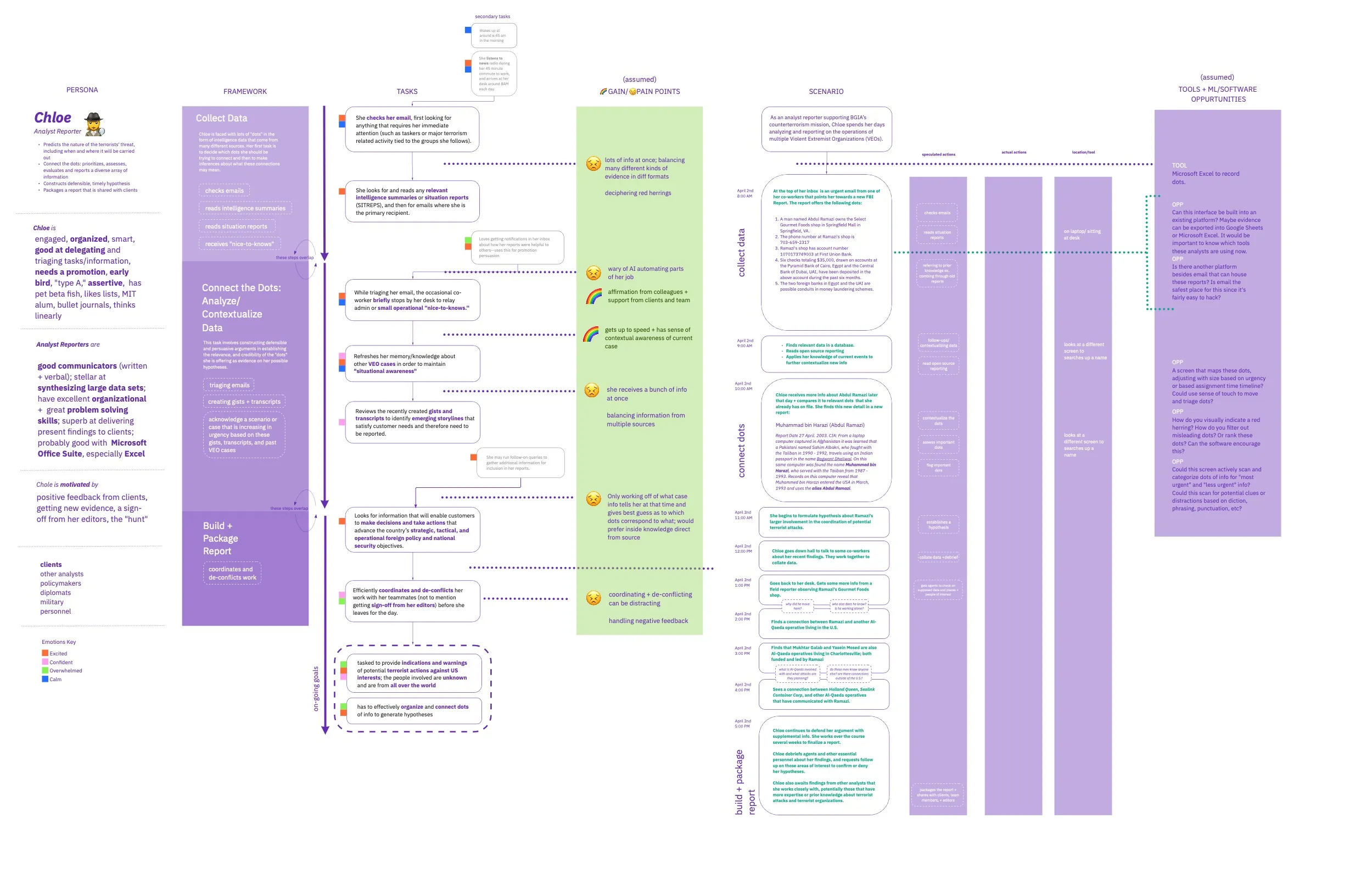
Persona for Chloe, the analyst reporter. Including task flow, pain points, etc.
We interviewed several intelligence analysts throughout our process. This helped us better understand Chloe's process and how we could improve it. We mapped out our takeaways from these interviews.
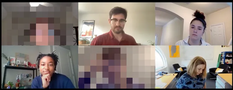
Faces are blurred for the privacy of the analysts
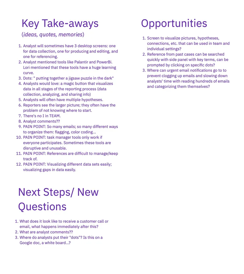
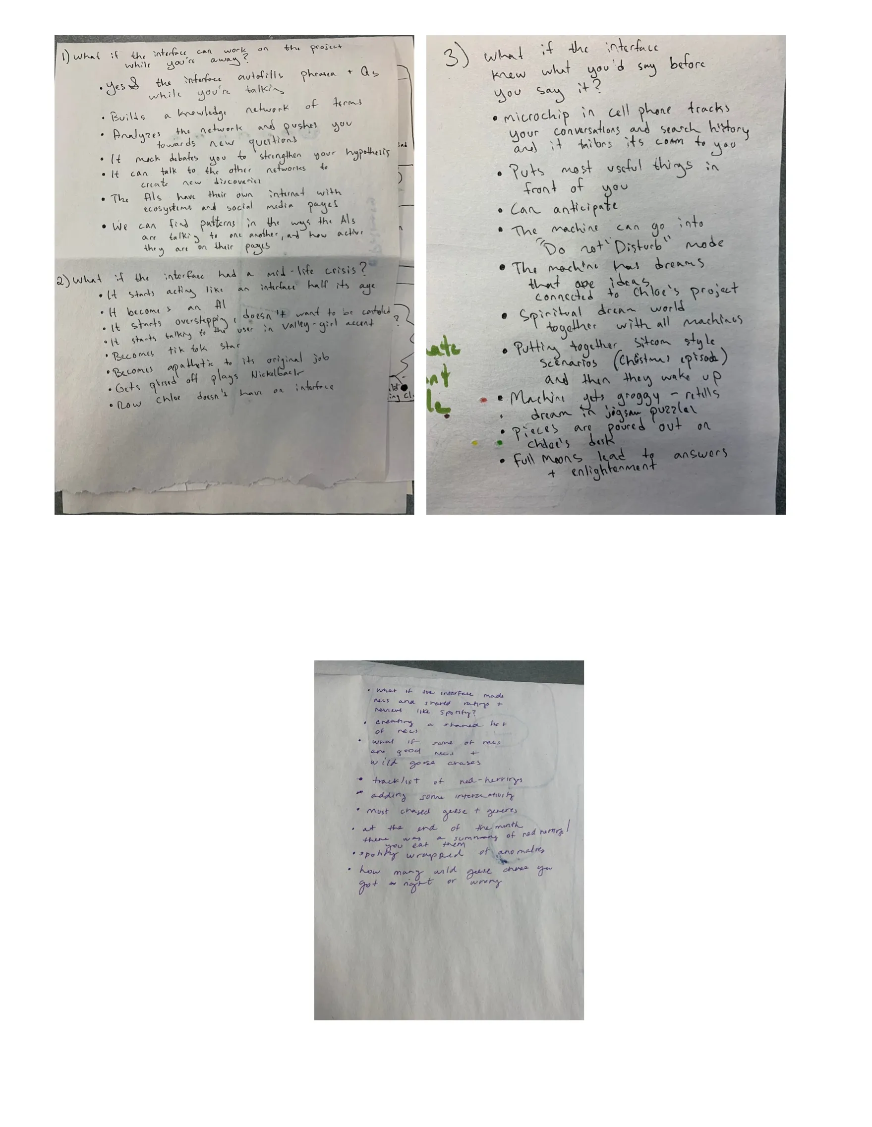
We did a ton of low fidelity sketching and proceeded to "kill our babies."
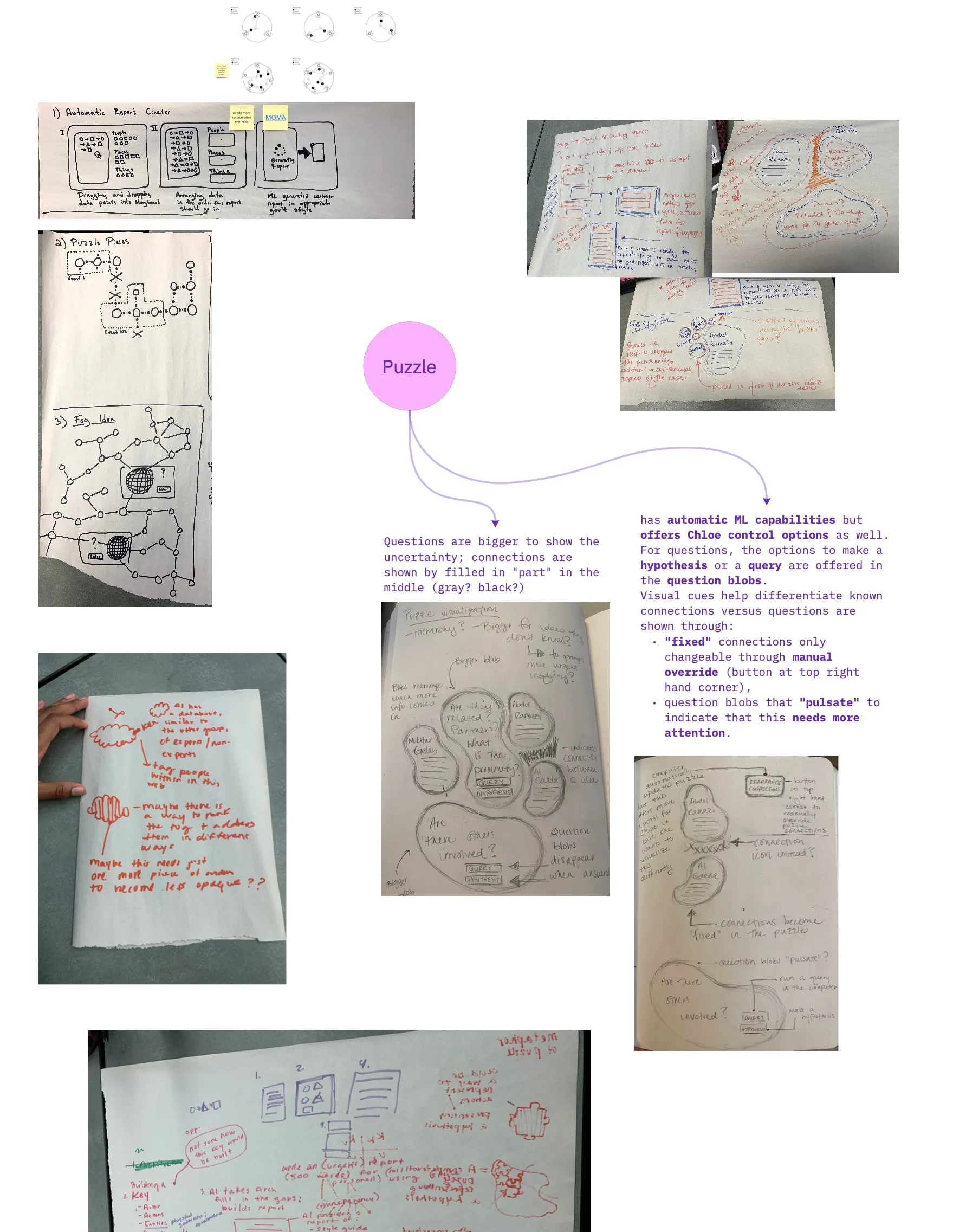
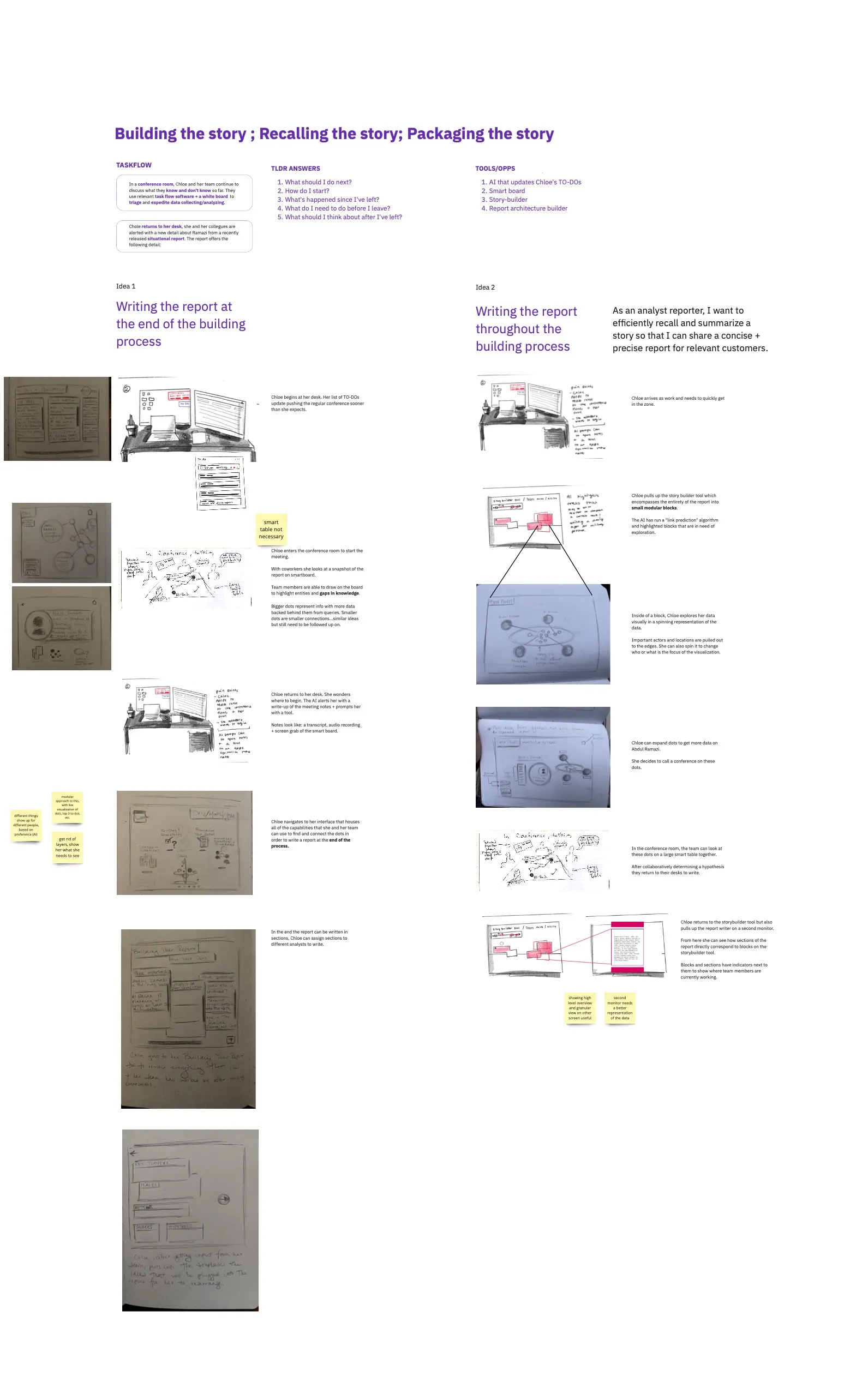
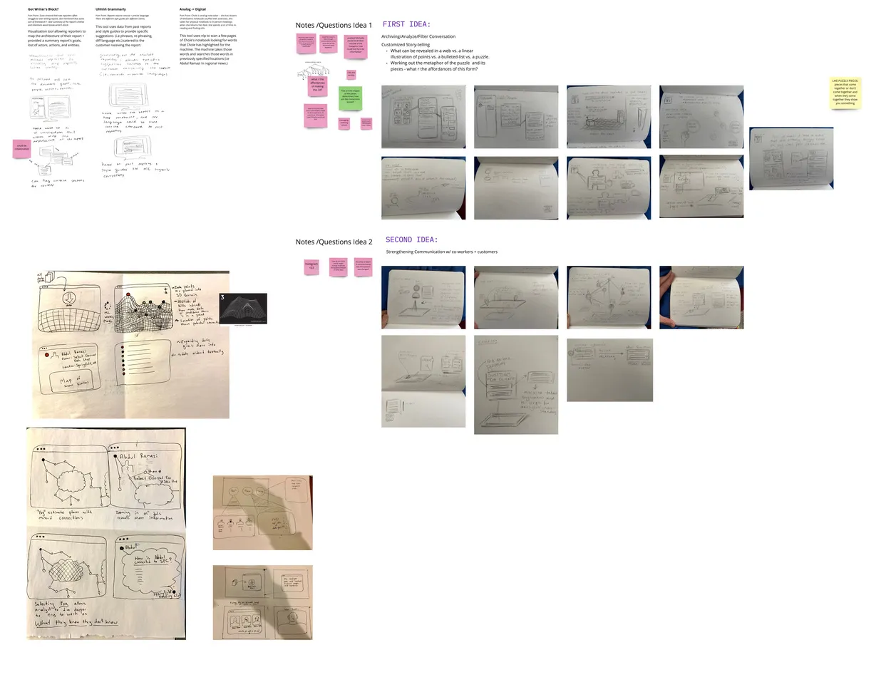
Here is one of the concepts that I further developed. I think it was a good idea but I allowed myself to kill this one.
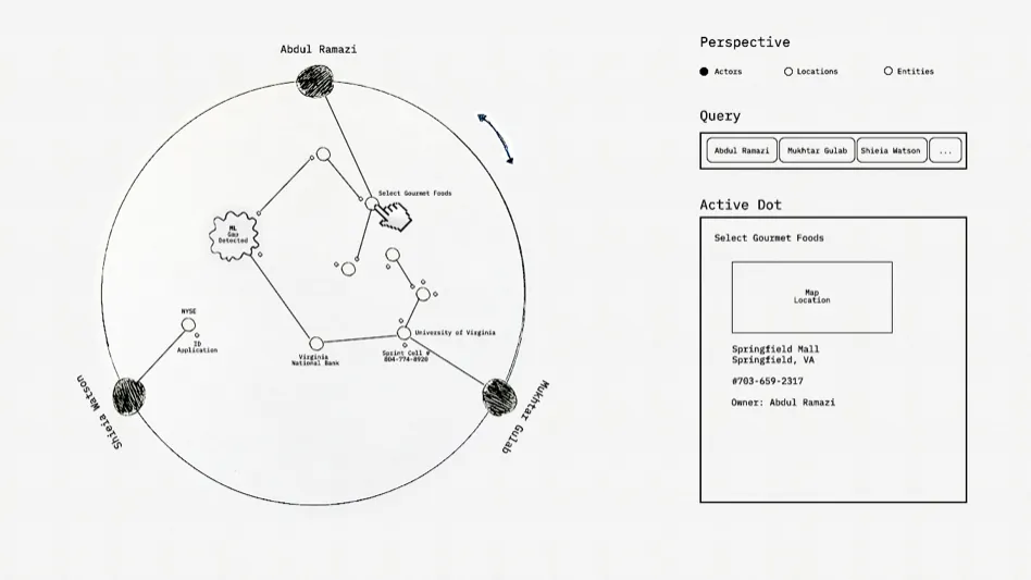
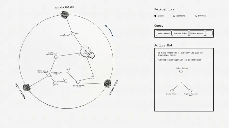
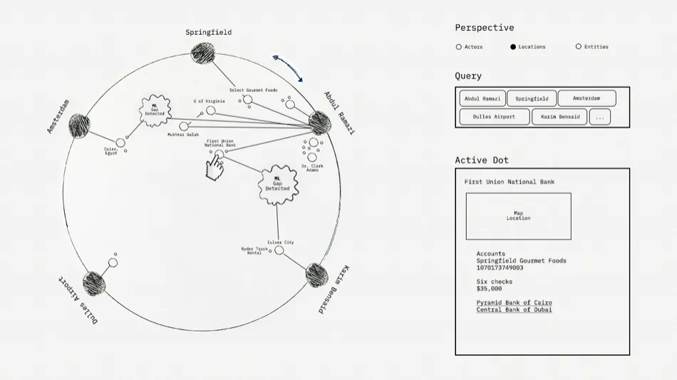
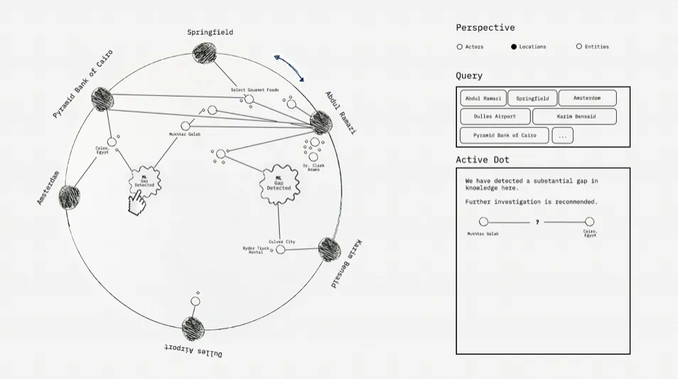
Version 1
