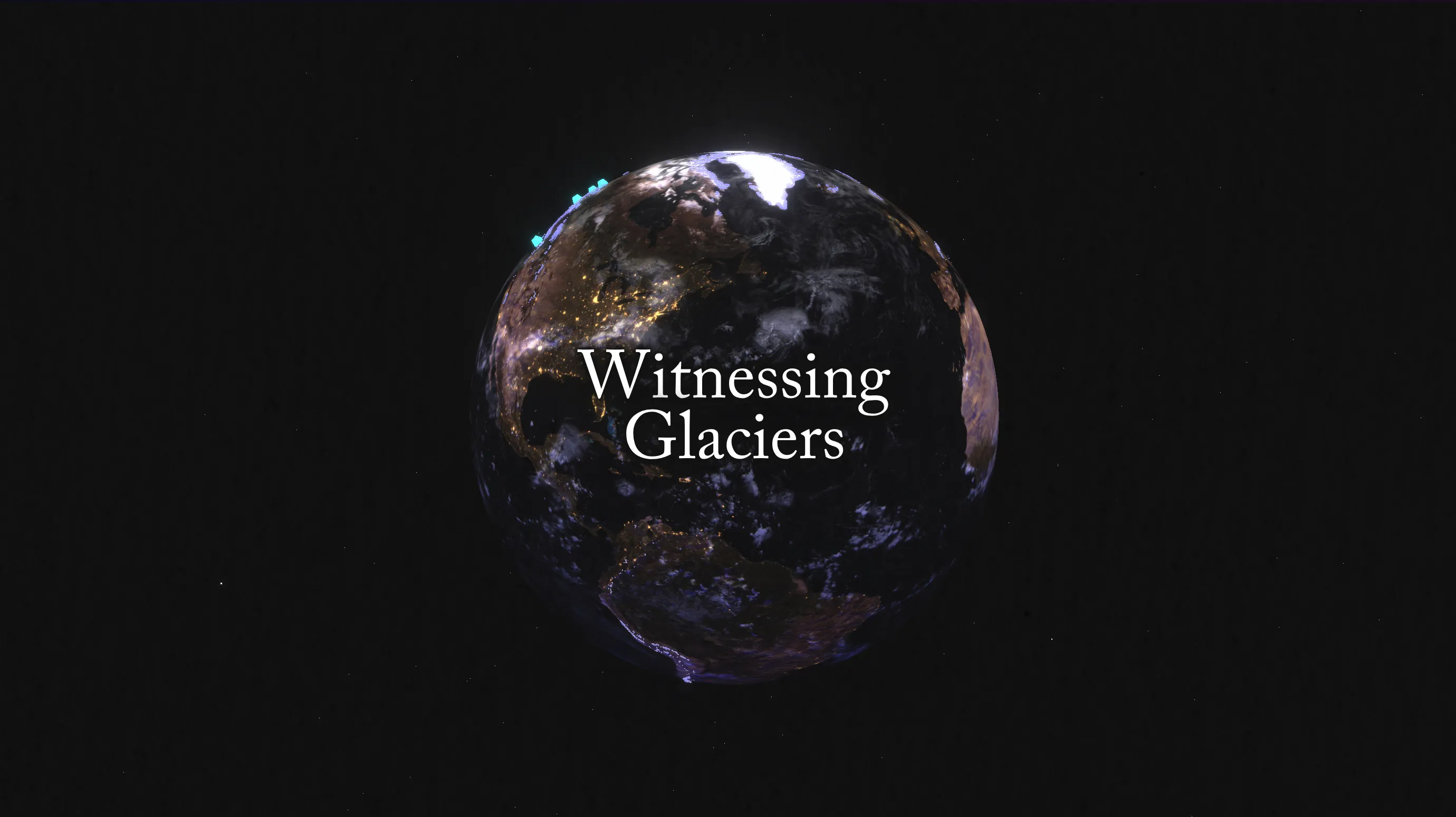
Witnessing Glaciers
I started with background research on glaciers, first focusing on the Alps and then widening out to the whole world. The turning point was finding the World Glacier Monitoring Service's database, which tracks the size and mass of glaciers worldwide over time. Once I had the data, I started sketching ways to present it.
Collecting research in Figma
In Processing, I coded animations showing how quickly glaciers around the world are shrinking. The WGMS dataset also highlights a set of "benchmark glaciers," which are heavily monitored and stand in for global glacier trends.
 First Processing sketch


Alongside the data work, I ran looser studies to spark ideas. One of them stuck. I converted the glacier data into MIDI notes and played them through a synthesizer. The sounds came out ancient and otherworldly, and they set the art direction for the final website.
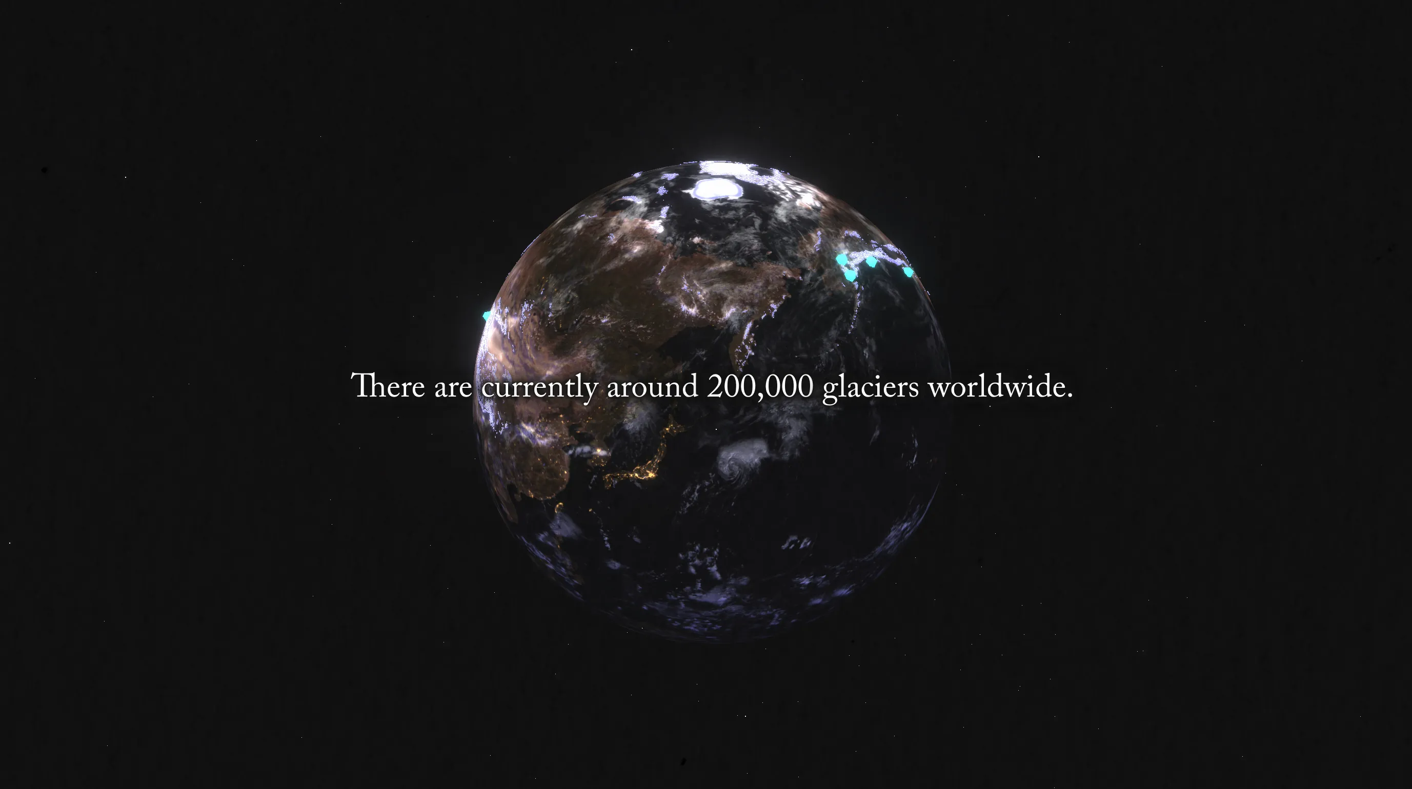
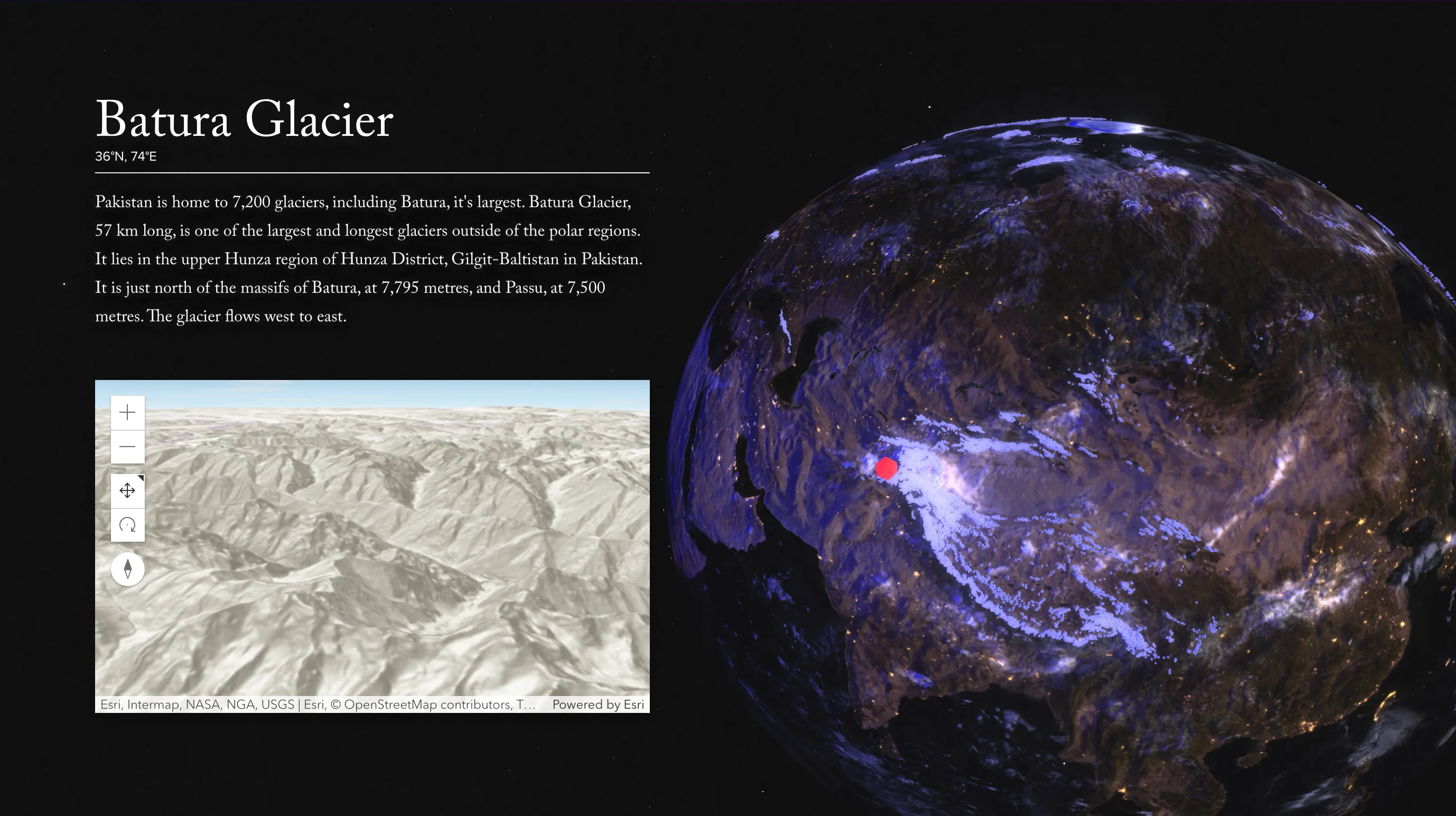
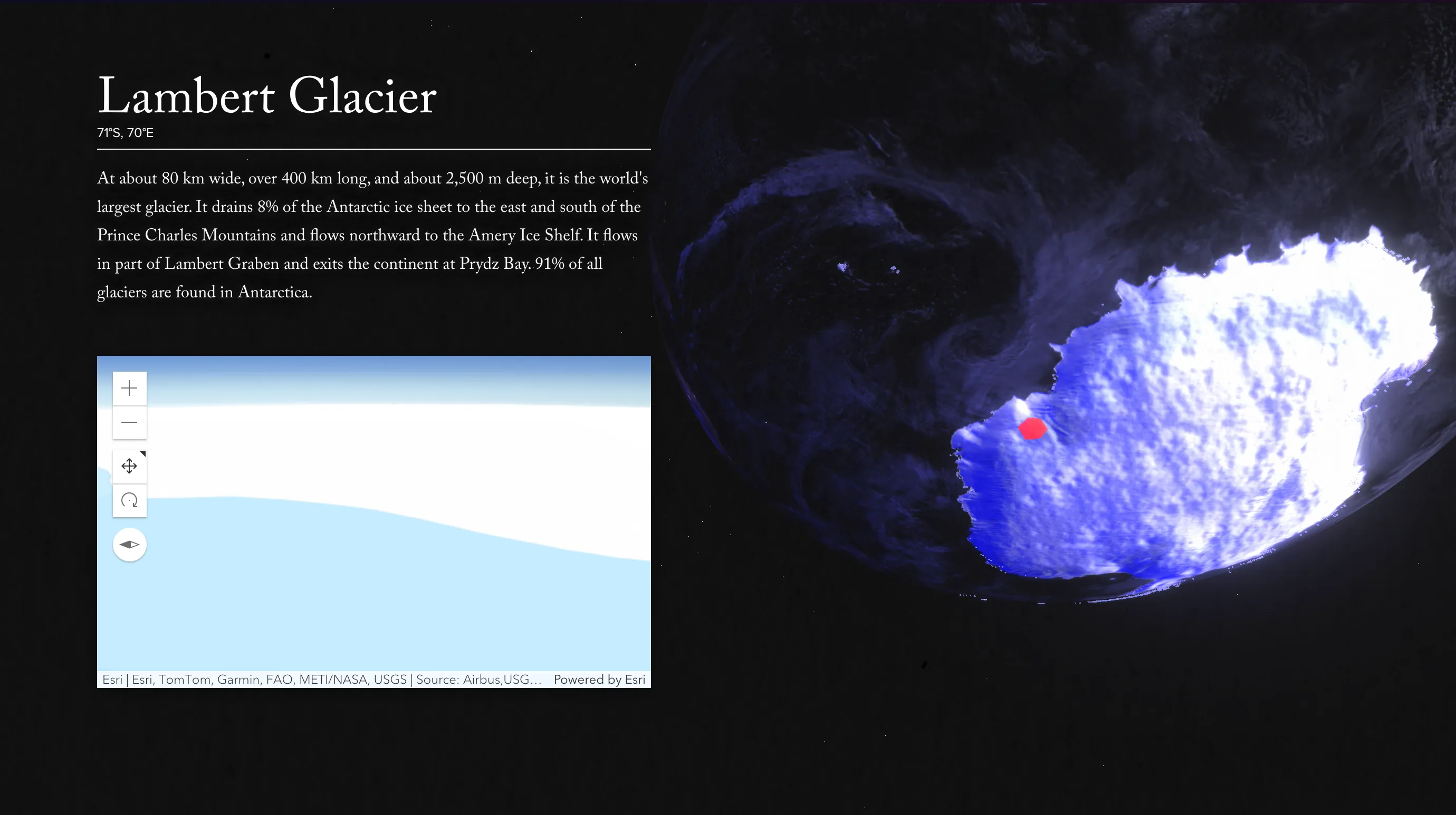
The final piece is an interactive scrollytelling website. Using Three.js, I built a 3D model of the Earth and mapped all the world's glaciers from the WGMS database onto the sphere. As you scroll, the camera moves around the globe, zooming in on key glaciers and narrating their decline. The site turns the dataset into a story you can explore, one glacier at a time.